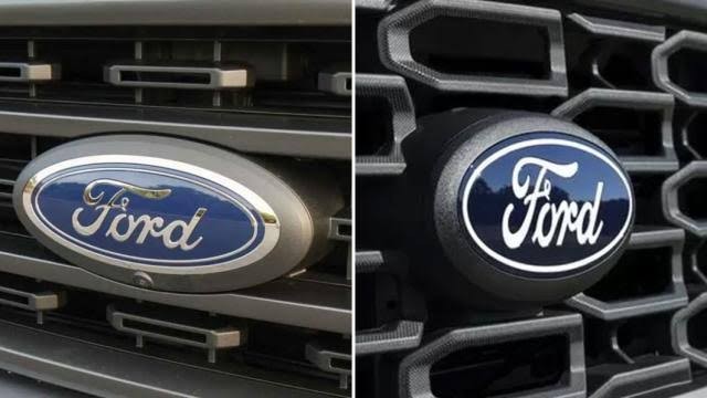
Ford, the renowned American automaker, has recently updated its iconic "blue oval" logo. The new design is a testament to the brand's commitment to evolution and innovation.
This article will delve into the changes and the reasons behind them, as well as take a journey through the history of Ford's logos.
A New Look for a New Era
The updated logo made its debut on the 2024 F-150. The changes are subtle yet significant, with the removal of the thin silver oval outline inside the badge. This allows the "Ford" script to be enlarged, making it more prominent on the front of the vehicles.
The chrome border around the outside and the script are now finished in white. This gives the logo a slightly retro appearance, harking back to the brand's rich history while looking forward to its future.
Focused and Legible
The new logo is more legible and focused. The Ford script is easier to read from a distance, a crucial factor considering the logo's placement on vehicles. This change is only for vehicles, not the corporate logo, showing Ford's dedication to improving customer experience at every touch point.
A Century-Long Evolution
The Ford logo history goes back more than a century, to the date when the Company was first established in 1903. The simple wordmark might not seem like much, but it’s an incredible example of the power a minimalist emblem can offer.
The first time the “Ford” script appeared on a logo in the iconic text we’ve all come to recognize was in 1907. Since then, it’s been incorporated into every Ford logo, although the text has had minor alterations.
It wasn’t until 1927, 24 years after Ford’s inception, that Ford changed its logo to a similar design that it still uses today. While Ford has officially had three logo changes since then, they are incredibly similar to its current design. They all feature small changes, like making the oval rounder and making minor tweaks to the Ford script.
Conclusion
Ford's logo update is a perfect example of how brands can evolve their logos over time while staying true to their roots. The new design is cleaner, simpler, and more focused, reflecting Ford's commitment to innovation and customer satisfaction. As we move into the future, it will be interesting to see how this iconic logo continues to evolve.

Comments (0)
Please login to join the discussion
Be the first to comment on this article!
Share your thoughts and start the discussion